Directional monogram identity
A rebuild of a 30-year-old freight brand around a directional 'N' mark, industrial type and a high-visibility palette.
Full brand kit: logo suite, colour system, vehicle livery and web application.
Portfolio · Logos
Identity work built from a single idea, then stress-tested at favicon size, on signage and across every screen.
A wider look at identities we've designed across industries.
Head spa, massage & wellness identity
Sports performance brand mark
Audio dubbing platform identity
Freight logistics monogram
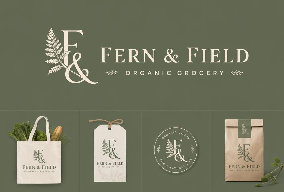
Organic grocery wordmark
Legal letterform system
Motion-first ring mark
Coffee roastery badge
SaaS platform mark
Architecture studio monogram
Skincare brand identity
Craft brewery crest
Fintech identity system
Surf brand and apparel marks
Veterinary clinic identity
Music label mark
Restaurant wordmark
Solar energy brand mark
A rebuild of a 30-year-old freight brand around a directional 'N' mark, industrial type and a high-visibility palette.
Full brand kit: logo suite, colour system, vehicle livery and web application.
Hand-drawn leaf ligature paired with a warm serif for an organic grocery brand moving into retail.
Packaging-ready mark in 9 lockups across 4 product lines.
A stripped-back geometric mark and legal-grade type hierarchy that reads as confident rather than stuffy.
Adopted across web, documents and court filings.
An animated ring mark designed for video-first channels, with static fallbacks for print and apparel.
Animated logo system used across 60+ social assets.
Tell us about your project and we'll send back a free audit.
support@buildtheory.appWe present three distinct directions, then refine your chosen route through two revision rounds until it is right.
Everything you need: vector source files, web and print exports in every common format, plus light and dark variants and a simple usage guide.
Yes. We can modernise an existing mark while keeping its recognition, which is often smarter than starting from scratch.